jay cowle
ux design lead


BRIEF: UNIVERSITY OF SURREY SUBJECT CAMPAIGN PAGES
I was asked to update the design for 19 campaigns pages promoting undergraduate and postgraduate degrees. My personal goal was to create a template that would work for all these pages.

1. RESEARCH (PERSONAS, DATA, COMPETITOR)
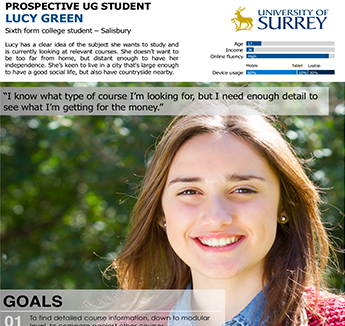
My first step in any project is to ask my client to complete my quick design brief. This helps us both get on the same page and focus on user needs. If it's a clients first time working with me I'll often suggest completing the form together to explain the thinking behind it.
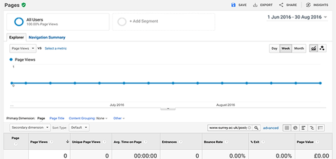
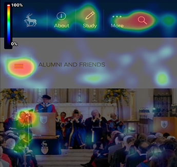
As this project was an update of existing pages I researched the user behaviour on the old pages (using Google Analytics and SessionCam heat maps and session recordings) to see what content is useful and what is ignored. I will then talk the client through my findings or create a research document.
Once I have an idea of the priority of content for users and the business it's time to wireframe. Sometimes this will be an on paper sketch with the client or, if I feel I need more time to think, I'll create a digital wireframe using Sketch.
2. WIREFRAME (TALK, SKETCH, USER FLOWS, WIREFRAMES)
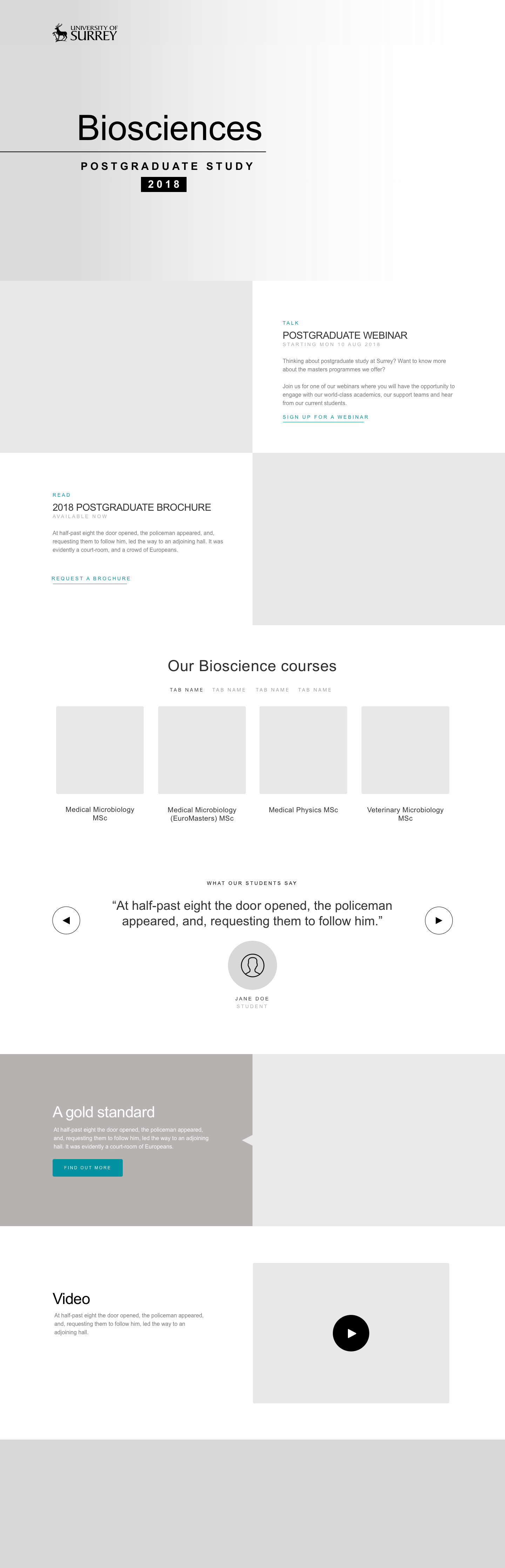
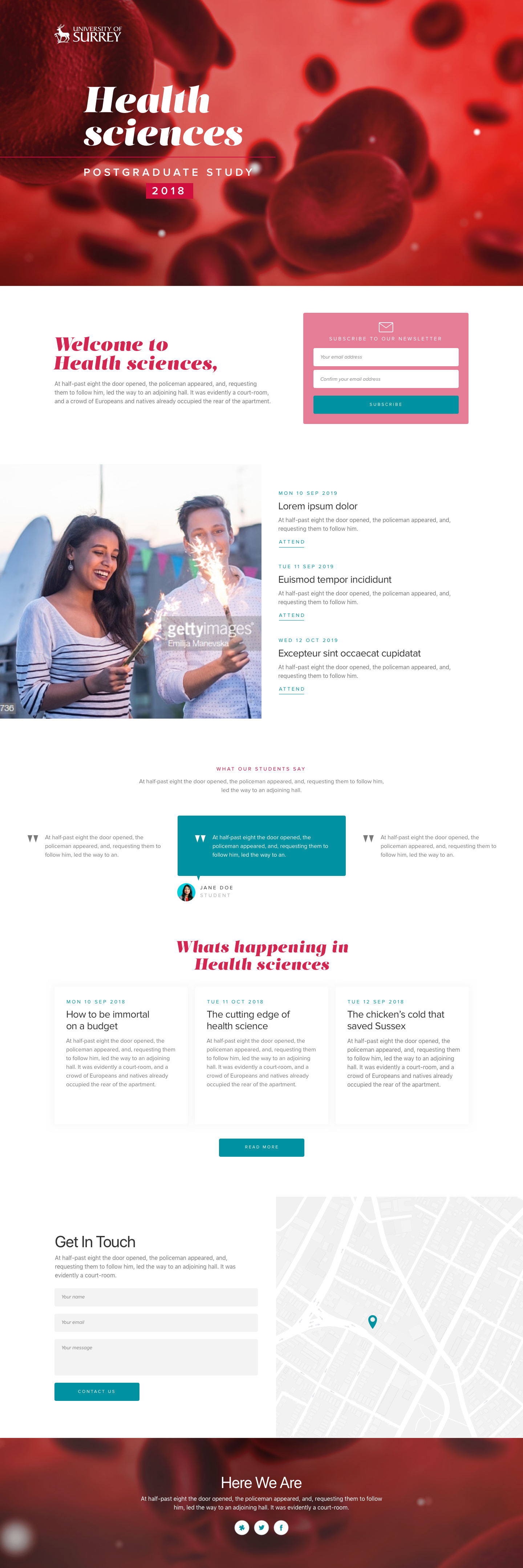
3. CONCEPTS AND DESIGNS
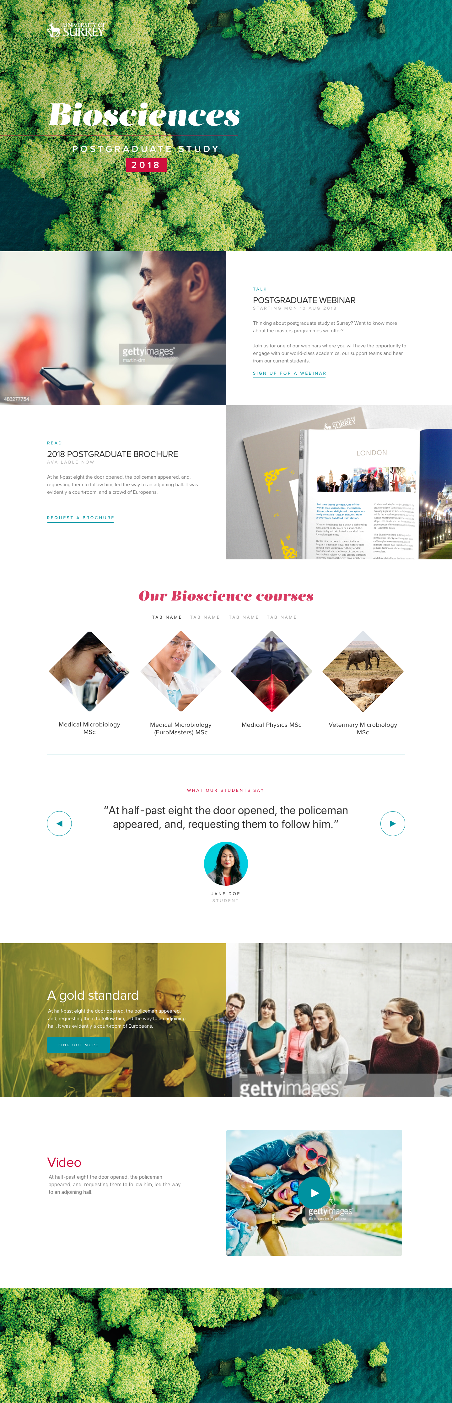
Knowing this was an important project, with some time and money behind it, I also created a page of optional extras the marketing might want to consider using in their campaign.
4. TEST
I use a variety of methods to test concepts. These range from showing the designs to the bi-monthly User Groups I run at the University, creating clickable prototypes for A-B testing in these user groups (qualitative) or using a A-B testing company like AB Tasty for larger scale testing (quantitative). For smaller scale projects we may choose to build and release the project being prepared for quick iteration if any struggle spots are identified in the User Journey.
5. REVIEW: (DATA, USER GROUP FEEDBACK, ITERATE)
Based on the objectives set out in the Design Brief I will monitor the percentage of users completing the primary CTA's. This may range from signing up for an email or prospectus, to click through to view a course or to scroll through a page. Whilst it is not always the design causing low click throughs (for example if a campaign is boring or too complicated) if struggle points are identified I will look at iterating on the design to improve visability or suggest a different tact such as: 'Why not show this course from a student's perspective?'.